A website for the studio that builds them.
After a long time of working together, Huck Finch trusted us to design their own website. We delivered the design in 14 business days, with creative freedom to push it further. Their team handled the Webflow development.



Project Overview
Client
Huck Finch, strategy, design
and Webflow studio for SaaS
Timeline
14 business days
Services
Website design
Design system
Tools
Figma
01
A long time of working together. Room to go further.
Huck Finch already knew our work and how we approached a project. When they brought us in to design their own website, that familiarity gave us the confidence to bring forward ideas with more character and take the visual direction further.
Their team encouraged us to explore bold layouts, unexpected details and playful interactions. We could spend our time developing those ideas together, building on a relationship that was already in place.
02
Finding the direction before designing the pages.
We refined the selected direction with their feedback, then used it as the foundation for the page layouts and navigation.
03
Bold type, retro textures and details worth finding.
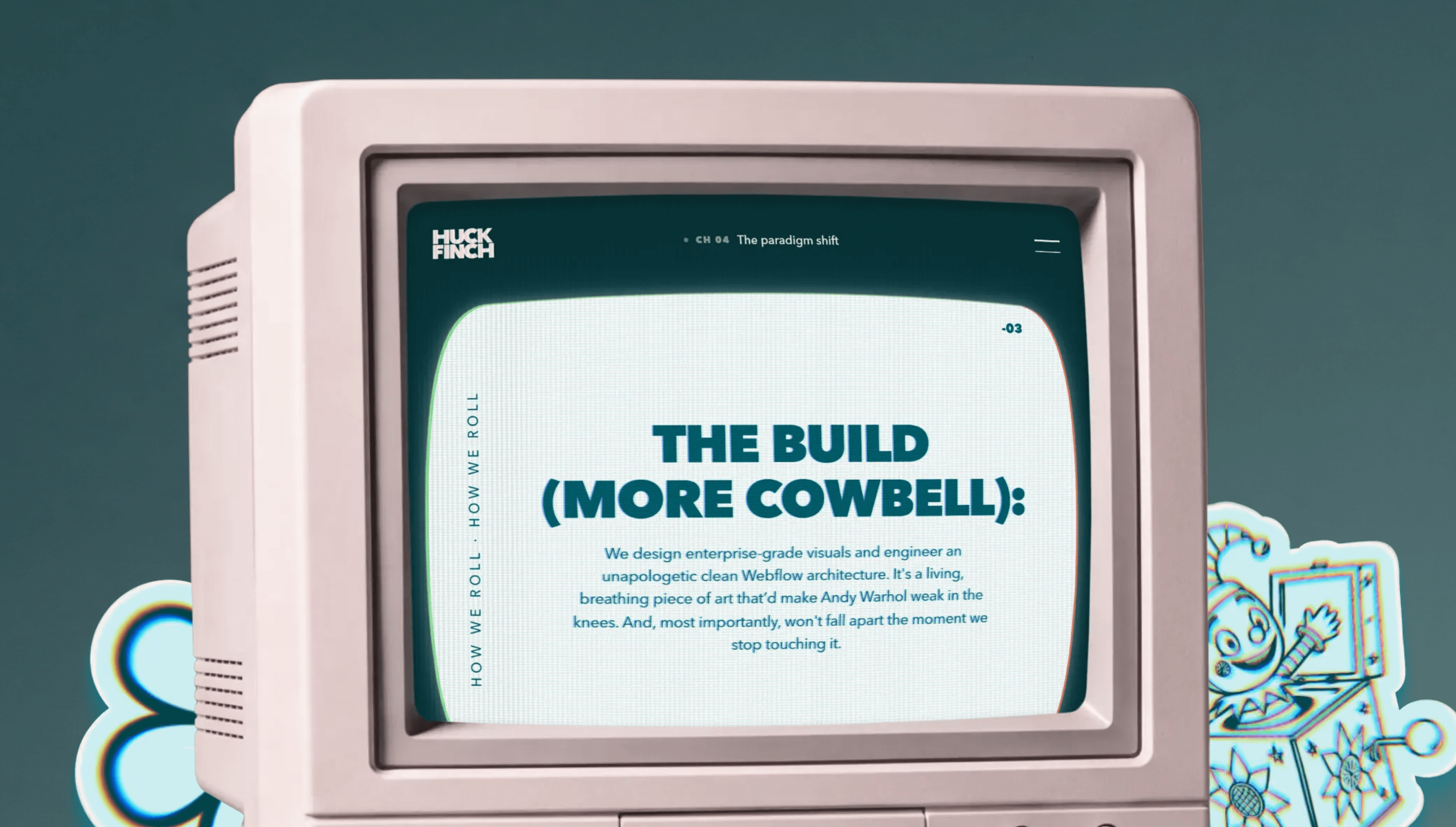
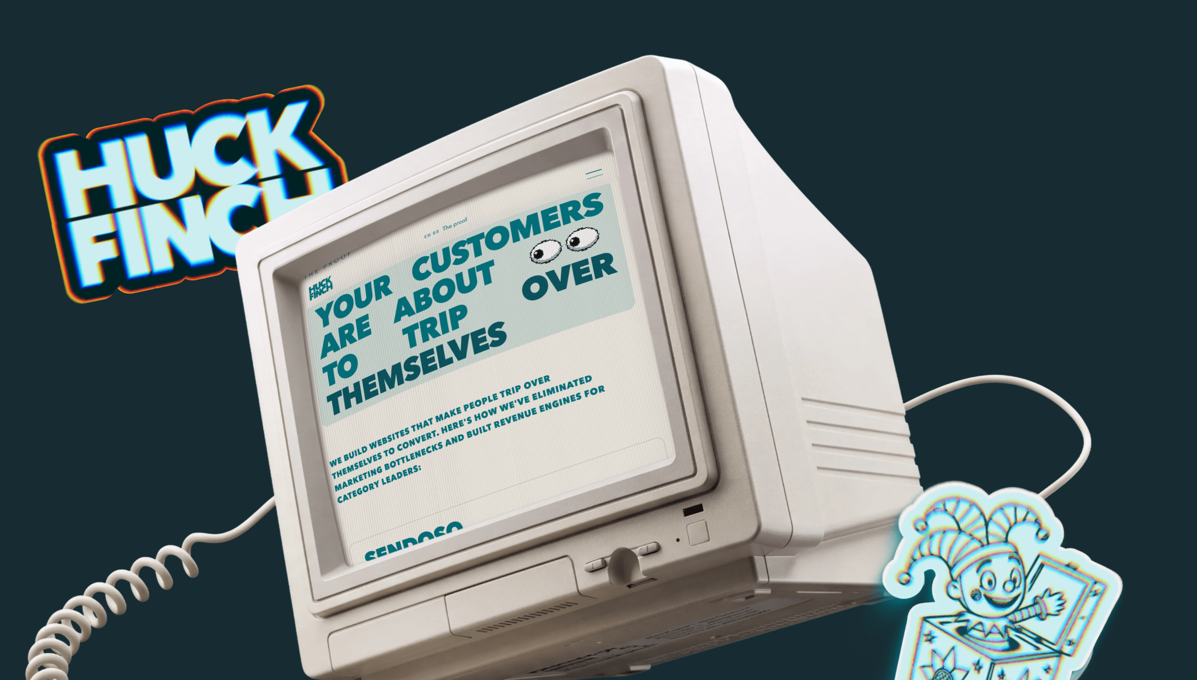
The retro treatment takes its cues from an old television screen. Scan lines, VHS texture and subtle RGB distortion run through the design, adding texture around the content while keeping the message clear.
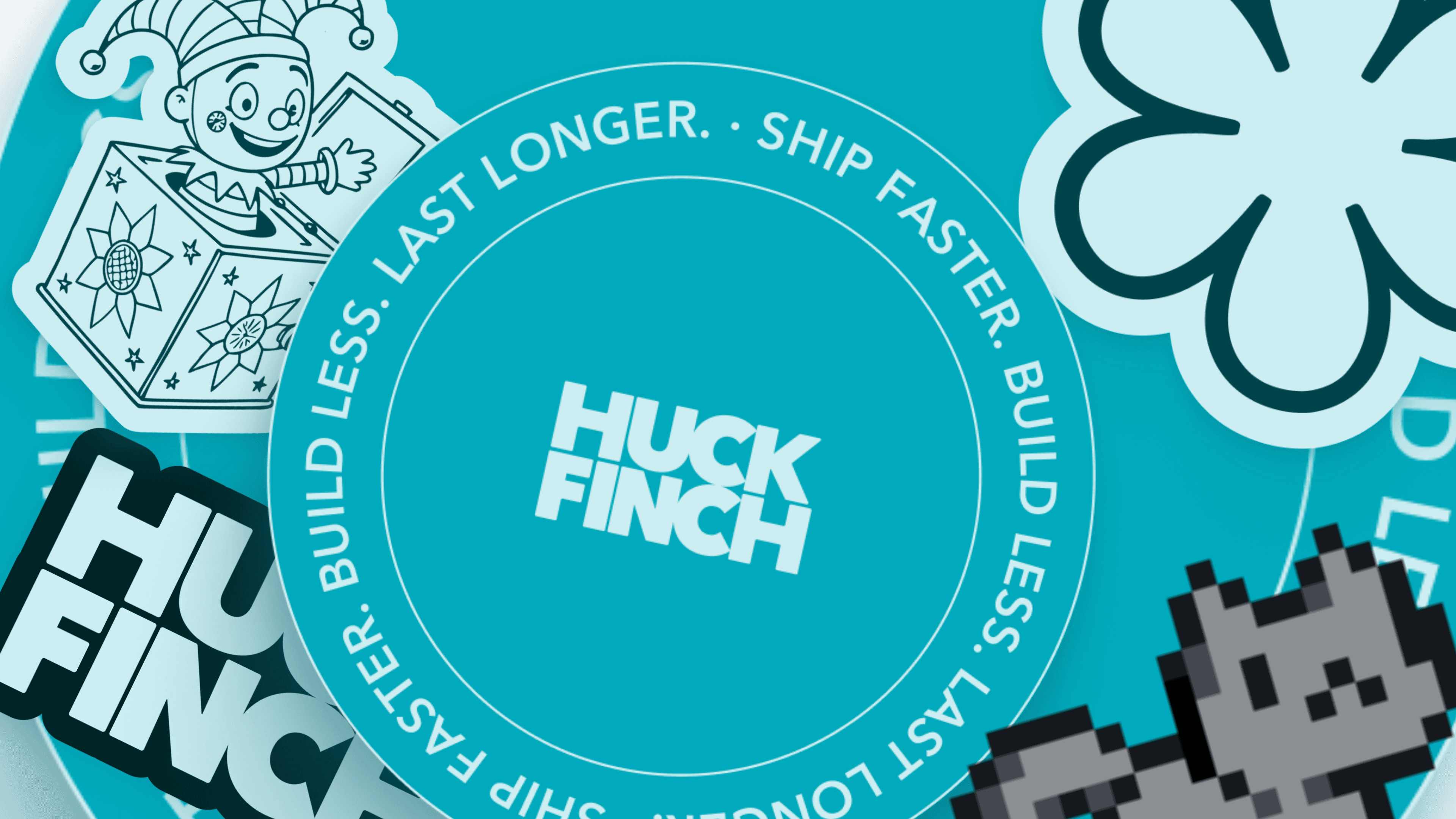
The smaller details bring the team’s humor into the site. Huck Finch sent us the GIFs they use most, which became references for pixel stickers, including the sabertooth tiger. A television in the footer closes each page, with a few easter eggs for visitors to discover along the way.
04
Feedback while the work was taking shape.
We worked directly with Matt, Hien and the Huck Finch team through Slack and Figma, with our project manager keeping everyone updated as the design progressed.
Each page went into review as soon as it was ready, while we continued designing the next one. Feedback reached us while decisions were still taking shape. When Hien suggested a lighter hero, the revised version was in the file that same morning.

05
A design system behind the personality.
Oversized headings, pixel stickers and retro textures give the site its character. The design system brings those elements together, establishing how typography, color and recurring components work across the pages.
That shared foundation let us carry the same visual direction from the homepage into services, contact and CMS templates, while giving each page room for its own content.

06
The details carried into the handoff.
The files included Home, Services, Ethos, About, Contact, CMS templates, navigation, the design system and four social preview image options. Loading animations, scroll transitions, parallax, hover effects and easter eggs were documented alongside the layouts, so the team had a reference for translating those details into the live site.


Good work starts with a team you trust.
Get to know Apta and tell us what you have in mind. We’ll work out how our team can support yours.