
In 8 weeks, a site that carries 6 years of work.
We designed and built a Framer website for a Vancouver production company: five pages up front, 20+ pages and a full CMS behind them.



Project Overview
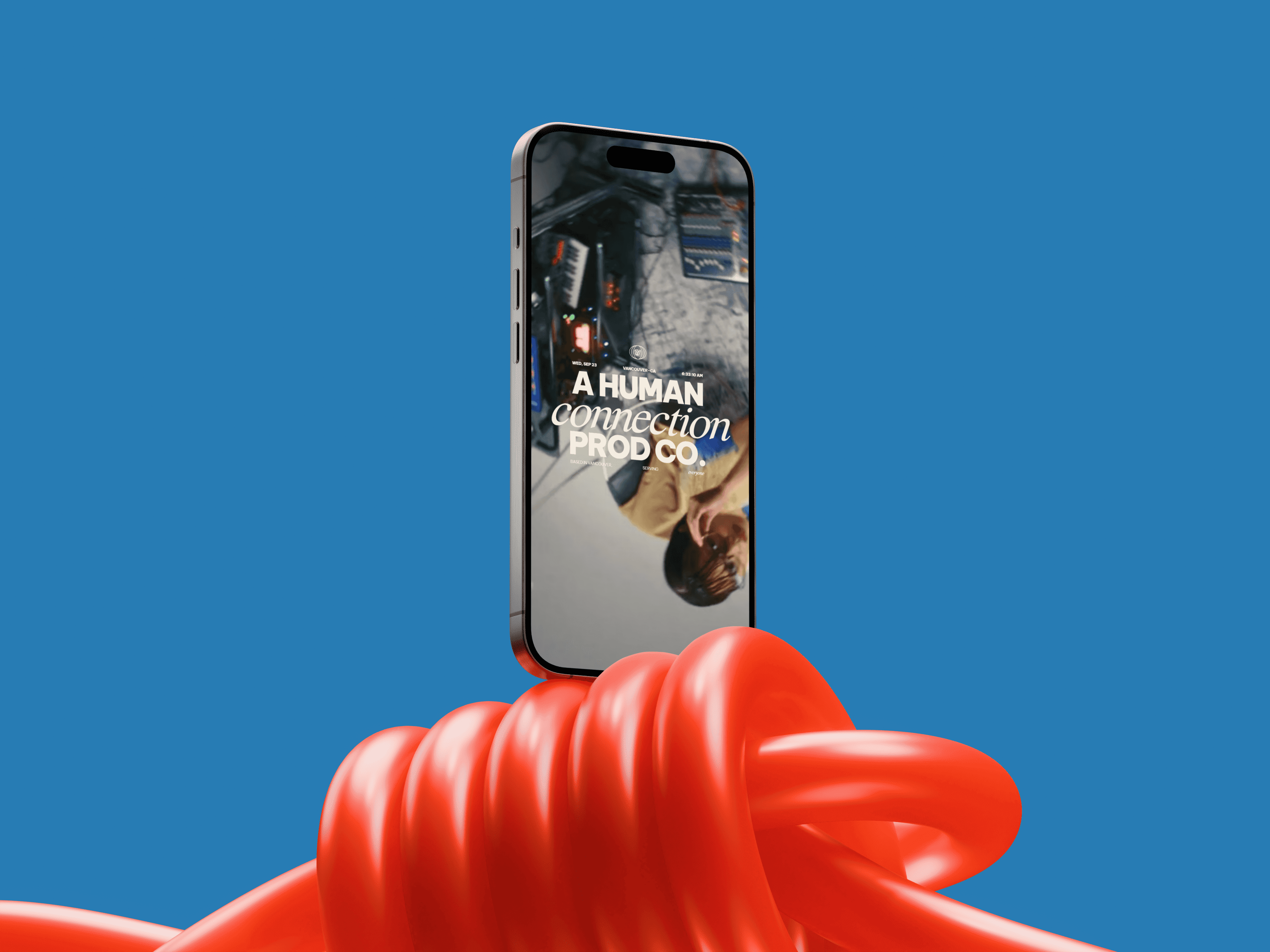
For six years, Workshop Film Company has made commercials, brand films and branded docs for brands and agencies like G-Shock, Moderna and Western Union. Their website no longer kept up with the work or with their new brand. The Workshop team gave us one goal: a site where the work does the pitching.
For six years, Workshop Film Company has made commercials, brand films and branded docs for brands and agencies like G-Shock, Moderna and Western Union. Their website no longer kept up with the work or with their new brand. The Workshop team gave us one goal: a site where the work does the pitching.
"Working with Apta was fluid, collaborative and fun. They made me feel safe and understood."

Marcus Fung
Executive Producer
Client
Workshop Film Company,
production company in
Vancouver, Canada
Services
Website Design
Framer development
CMS setup
Timeline
8 weeks
Tools
Figma
Framer
01
Bringing the new brand to the web
Workshop's new brand came with a full brand guide, and our job was to carry it onto a website, where it has to move and respond to the visitor while leaving room for the films.
The brand only moves where it points at something. Blocky type, sticker buttons and graphics show up where there's something to look at or click, and everywhere else the screen belongs to the work.
Workshop's new brand came with a full brand guide, and our job was to carry it onto a website, where it has to move and respond to the visitor while leaving room for the films.
The brand only moves where it points at something. Blocky type, sticker buttons and graphics show up where there's something to look at or click, and everywhere else the screen belongs to the work.
02
Designing with the Brand System
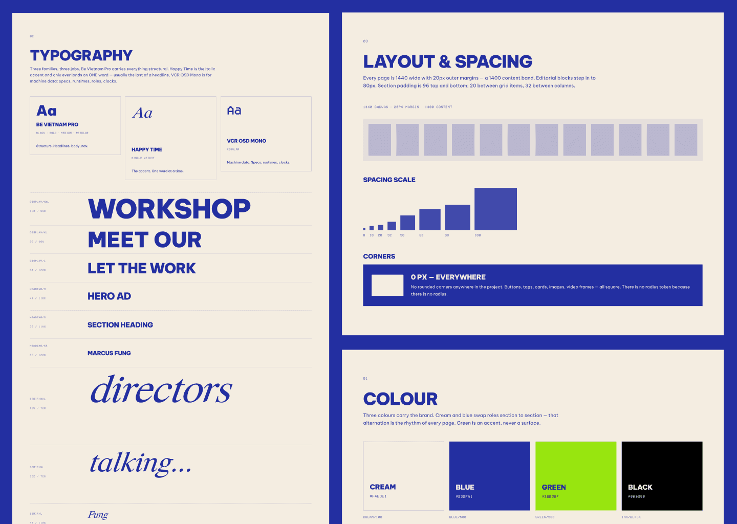
The site runs on three of the four colors in Workshop's brand guide and ten text styles. Monochrome blue carries most of it, cream gives long blue stretches room to breathe, and lime green is saved for small highlights. Sections alternate between cream and blue, so composing a new page never means choosing a color again. Type is set in Be Vietnam Pro Bold and Satoshi.
Lime green also became the cursor: a small green dot replaces the default pointer, so the brand's accent follows every move the visitor makes.
The site runs on three of the four colors in Workshop's brand guide and ten text styles. Monochrome blue carries most of it, cream gives long blue stretches room to breathe, and lime green is saved for small highlights. Sections alternate between cream and blue, so composing a new page never means choosing a color again. Type is set in Be Vietnam Pro Bold and Satoshi.
Lime green also became the cursor: a small green dot replaces the default pointer, so the brand's accent follows every move the visitor makes.
03
Site architecture
Five pages in the menu, each answering a question a buyer asks, in order: what have you made, who directs it, who shoots it, how do you work, how do I reach you.
Blueprint, the page on how Workshop works, now presents four clear models: Agency, Direct to Brand, Production Services and Studio.
Five pages in the menu, each answering a question a buyer asks, in order: what have you made, who directs it, who shoots it, how do you work, how do I reach you.
Blueprint, the page on how Workshop works, now presents four clear models: Agency, Direct to Brand, Production Services and Studio.
04
From Figma to Framer, with a CMS the team runs
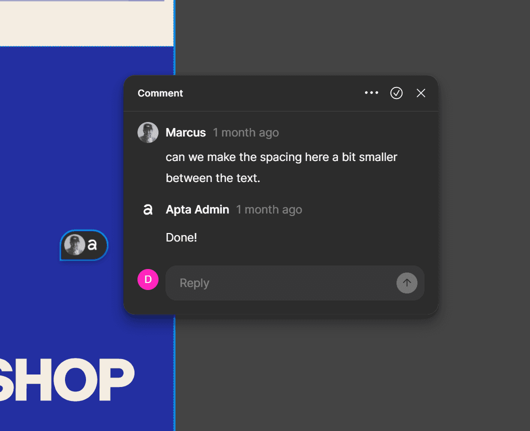
We designed the whole site in Figma with auto layout and settled the design before starting the build. The Workshop team commented right in the file, sharing references and asking for changes, and got an answer the same day.
Behind the five menu pages sit eight CMS collections and more than 20 pages. Credits are modeled as role and name pairs by department, so the Workshop team publishes a new film, director or photographer on their own, full crew list included.
Every breakpoint was designed, so the site works on a laptop during a pitch and on a phone between meetings.
With the file already structured on auto layout, the Framer build took 17 days.
We designed the whole site in Figma with auto layout and settled the design before starting the build. The Workshop team commented right in the file, sharing references and asking for changes, and got an answer the same day.
Behind the five menu pages sit eight CMS collections and more than 20 pages. Credits are modeled as role and name pairs by department, so the Workshop team publishes a new film, director or photographer on their own, full crew list included.
Every breakpoint was designed, so the site works on a laptop during a pitch and on a phone between meetings.
With the file already structured on auto layout, the Framer build took 17 days.

Behind the five menu pages sit three CMS collections and more than 20 pages: 14 films with full credits, six directors, two affiliates and four photographers with their own portfolios.
Workshop's team adds a new film the week it wraps, without calling anyone. Every breakpoint was designed, so the site works on a laptop during a pitch and on a phone between meetings.
Behind the five menu pages sit three CMS collections and more than 20 pages: 14 films with full credits, six directors, two affiliates and four photographers with their own portfolios.
Workshop's team adds a new film the week it wraps, without calling anyone. Every breakpoint was designed, so the site works on a laptop during a pitch and on a phone between meetings.

05
The Work page
The Work page gets the most visits, so it got the most design time. Visitors filter by commercial, stills or reel, see award badges right on the thumbnails and preview each project before they click. A green "see project" sticker follows the cursor across the grid.
Previews had to feel like cinema and answer instantly, and an embedded player needs a chain of requests before a single frame appears, so we built our own. One set of controls runs files, YouTube and Vimeo alike, and each preview loads a screen ahead of the scroll behind the film's own still frame, so the hover only has to press play.
Every project page also has a behind-the-scenes gallery that opens like a folder, one click per collection. For a production company, a look at the set says a lot about how the team works.
The Work page gets the most visits, so it got the most design time. Visitors filter by commercial, stills or reel, see award badges right on the thumbnails and preview each project before they click. A green "see project" sticker follows the cursor across the grid.
Previews had to feel like cinema and answer instantly, and an embedded player needs a chain of requests before a single frame appears, so we built our own. One set of controls runs files, YouTube and Vimeo alike, and each preview loads a screen ahead of the scroll behind the film's own still frame, so the hover only has to press play.
Every project page also has a behind-the-scenes gallery that opens like a folder, one click per collection. For a production company, a look at the set says a lot about how the team works.

06
Directors and Photographers
They have separate pages, each designed around how their work gets judged. Directors appear as full-width name plates, surname in italic serif, like the opening titles of a film. Hover a name and that director's reel plays in place, with a green "see profile" sticker next to the cursor.
On the photographers page, no frame gets cropped to fit a grid. Each cover takes the proportions of the picture inside it, and the columns pack like a pinboard, so a portrait stands next to a landscape exactly as it was shot.
They have separate pages, each designed around how their work gets judged. Directors appear as full-width name plates, surname in italic serif, like the opening titles of a film. Hover a name and that director's reel plays in place, with a green "see profile" sticker next to the cursor.
On the photographers page, no frame gets cropped to fit a grid. Each cover takes the proportions of the picture inside it, and the columns pack like a pinboard, so a portrait stands next to a landscape exactly as it was shot.
07
The Contact page
The contact page keeps the energy up to the last click. Team portraits are black and white loops with heavy grain, so everyone moves slightly on screen. Tcharles, our creative director, added images that pop up as you scroll, and they became one of the Workshop team's favorite parts of the site.
The contact page keeps the energy up to the last click. Team portraits are black and white loops with heavy grain, so everyone moves slightly on screen. Tcharles, our creative director, added images that pop up as you scroll, and they became one of the Workshop team's favorite parts of the site.
Want this for
your studio?
A website and CMS built so your team can run it. Send us the brief that's been sitting on your list.


Join our Newsletter
A look inside our work, process and thinking.
Join our Newsletter
A look inside our work, process and thinking.



This will hide itself!