The Full Creative Stack Behind a Finance Education Empire

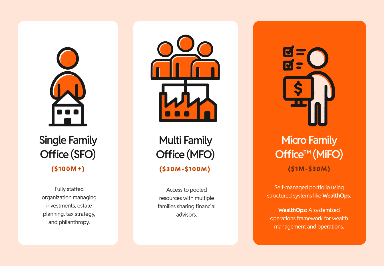
Brand Identity
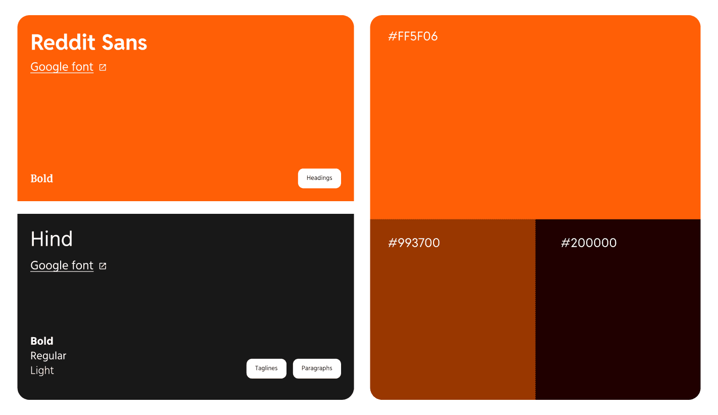
Logo, color palette, typography, and visual tone — everything that defines how WealthOps looks and feels. We built a system grounded in trust and sophistication, designed to resonate with a high-net-worth audience without feeling out of reach.
YouTube Production
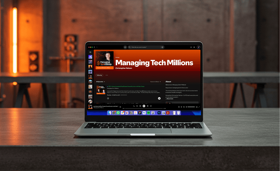
We edit virtually every video on the channel. Intro motion, lower thirds, graphics, pacing — each video follows the same visual system so the brand stays consistent across 50+ pieces of content. The channel looks like a media company, not a side project.
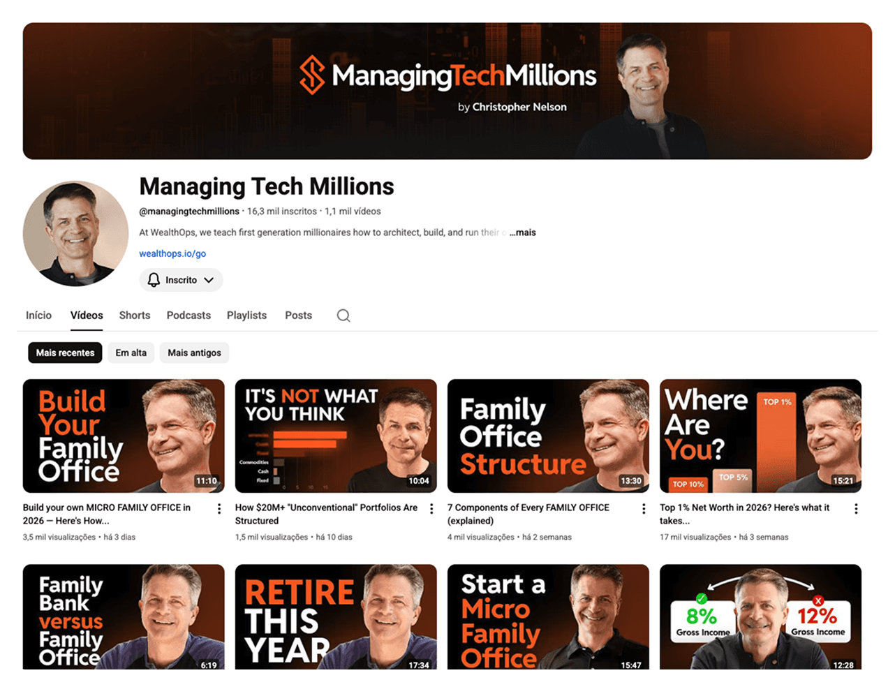
Social & Digital Assets
Thumbnails built to stop the scroll. LinkedIn covers and posts designed for a professional audience. Every asset speaks the same visual language — whether it shows up in a feed or pinned to a profile.
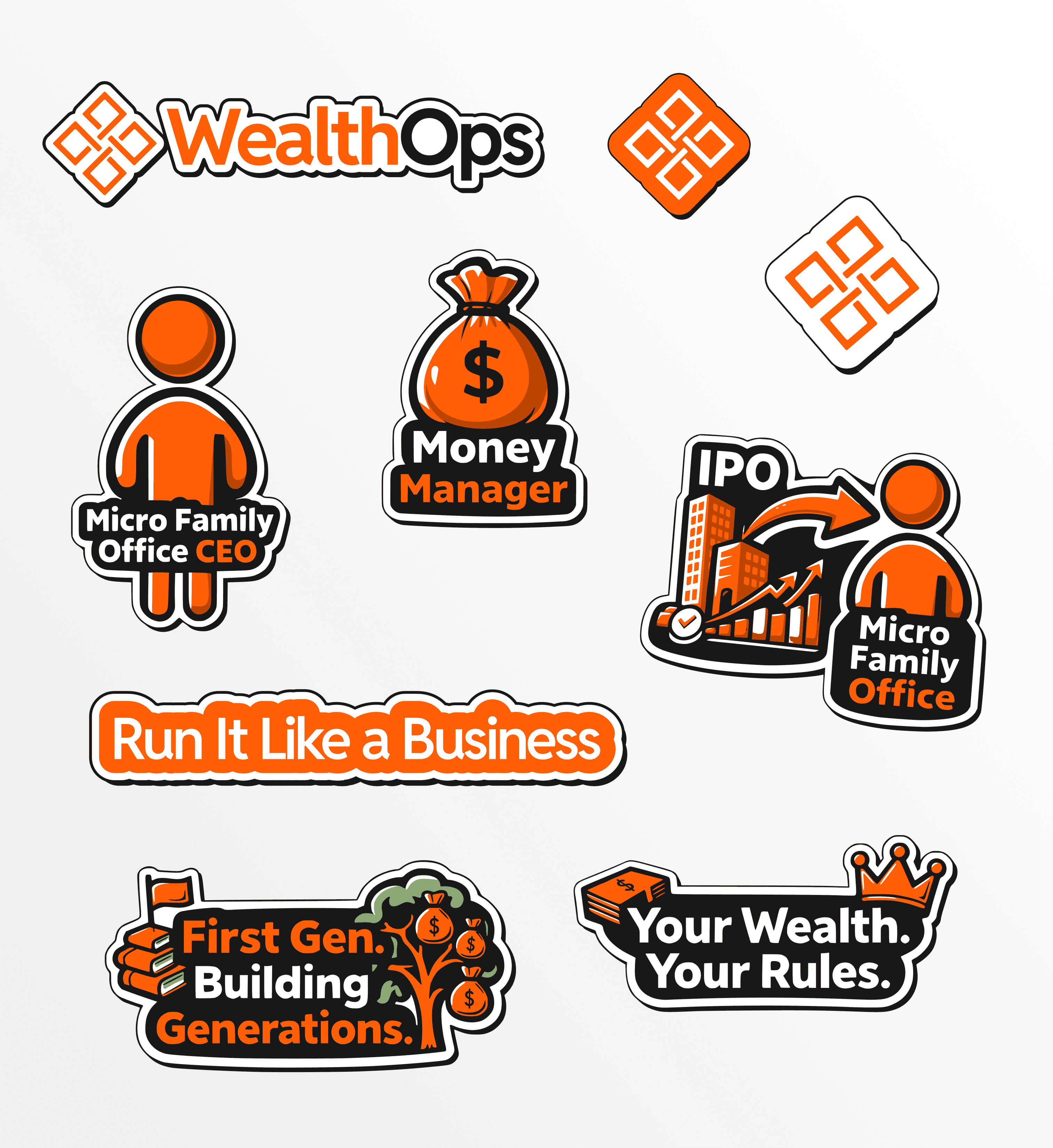
Brand Collateral
Stickers, desktop and mobile screensavers, newsletter visuals, blog assets — the touchpoints that make the brand feel real beyond the screen. Small details that add up to a brand that people recognize and remember.
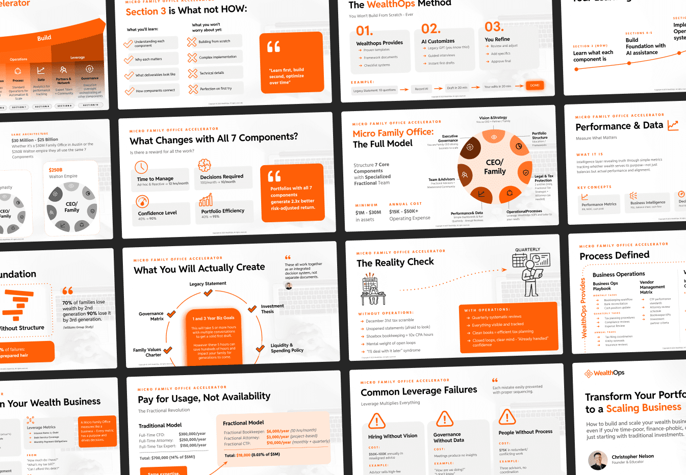
Course Slide Decks
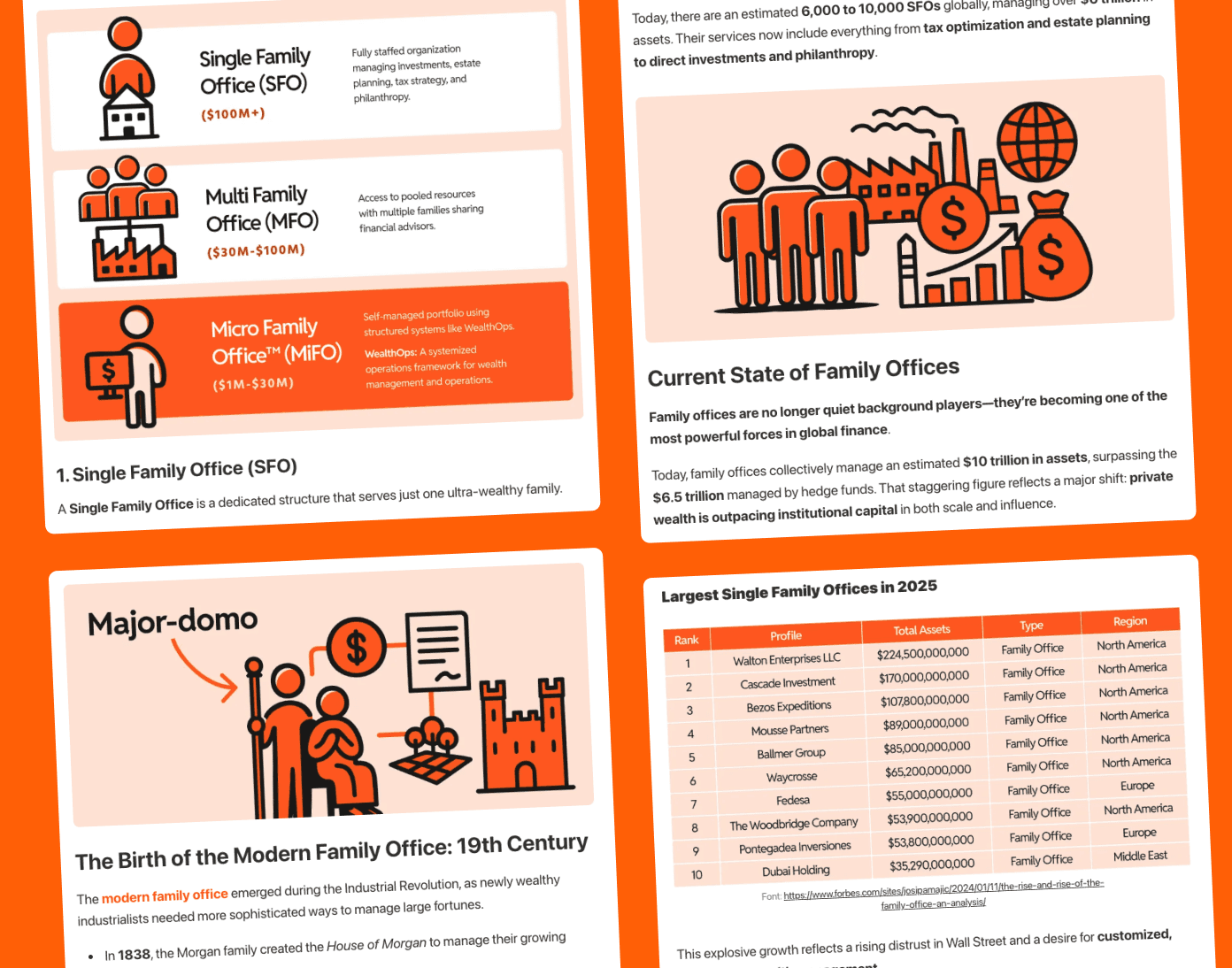
Over 1,000 slides built for WealthOps' course curriculum. Each deck follows the brand system — clean layouts, consistent typography, and visual hierarchy that makes complex financial frameworks easy to follow. The course looks as good as it teaches.
Newsletter subscribers