Moonvine: a 12-month case study in brand and product design.

Hey, we're excited about this one.
We'll talk about twelve months of work, from the first sketch to the launch of Moonvine.

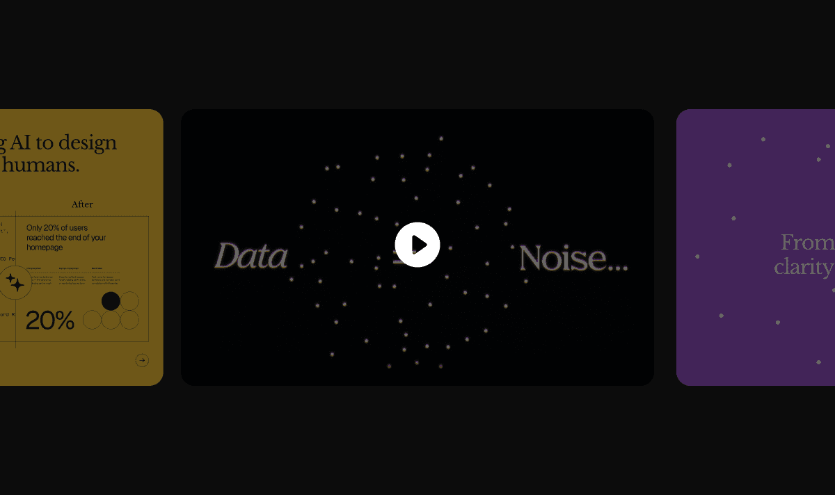
Check the video.
Moonvine came to us as an idea. A marketing intelligence product that turns scattered data (analytics, search, competitors, social) into a weekly briefing delivered every Monday morning.
How it started
The project came to us through Tom Conlon, founder of North Street Creative — a creative agency based in New York.
Tom had been working on Moonvine as a new product, and brought it to us as a partner agency. It was one of the first times we worked with another agency on a project of this scale.
Everything started as a Brand Sprint. One week to define a brand, that was the service we used to offer at the time.
We ran the sprint. Presented to Tom Conlon, and his answer was: "great, but I also need the product side of this."
That sentence changed the project. What was supposed to be a one-week engagement turned into twelve months, with one foot in brand and another in product design from that point on.
Weekly meetings with Tom every week from there. That became the rhythm — and it stayed the rhythm for a year.
JP, the creative director of the project, led the visual direction from start to finish.
Brand creation — logo, color, typography, defined as a system from the ground up.
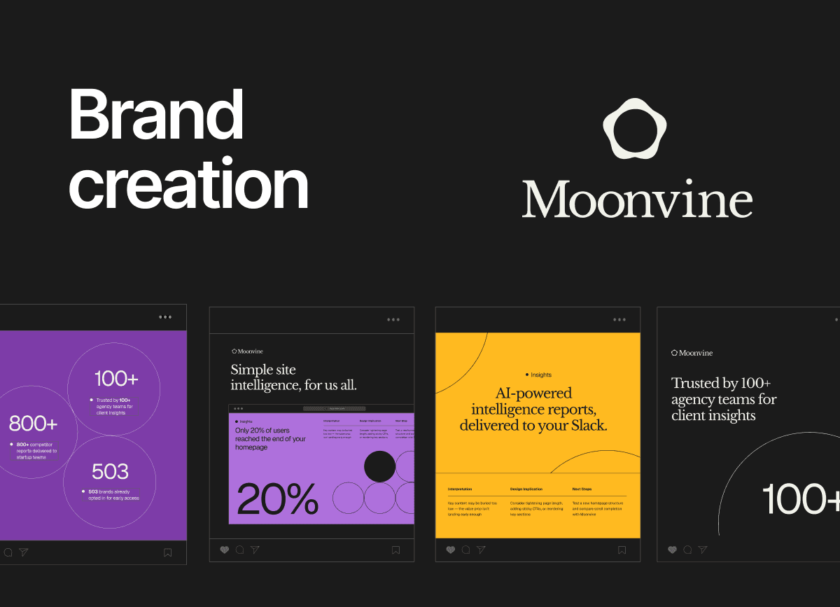
From the first sprint, the vision was already aligned: humanized, editorial, sophisticated. A serif font, a symbol with narrative behind it.
That was a deliberate choice. Most brands in this space, AI, analytics, SaaS, go for tech-startup-bold. Sharp sans-serif, loud color and copy.
Moonvine went the other way on purpose.
What ended up being explored more was the product. From the start, we treated brand and product as two separate visual systems. The brand could whisper.
The product had to deliver, bolder, functional, focused on clarity.
Two languages, one universe.
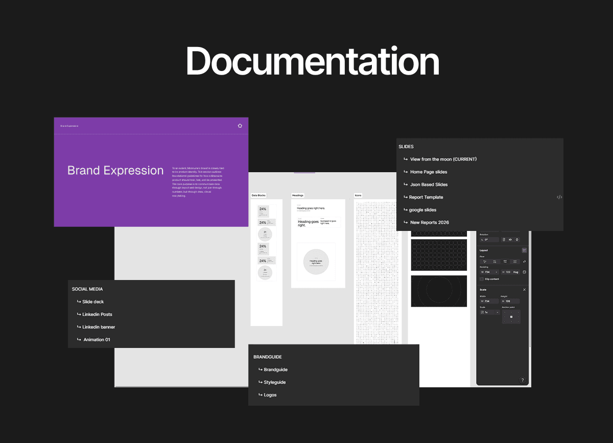
Style guide and brand guide — the rules and the manual. Documentation that lets the brand be applied by anyone, anywhere, without losing identity.

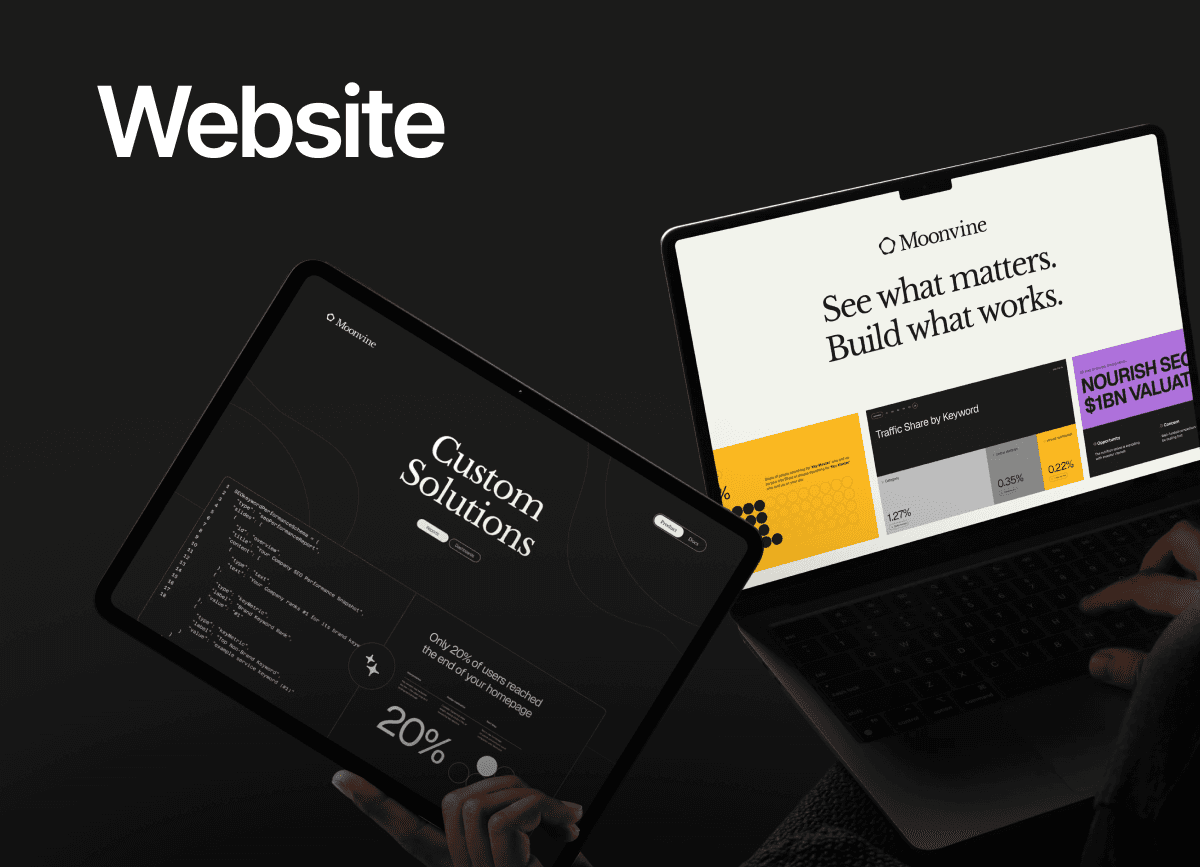
Website — built from the same system. Where Moonvine introduces itself to every visitor.
Documentation — internal docs, external docs, all in the brand voice.
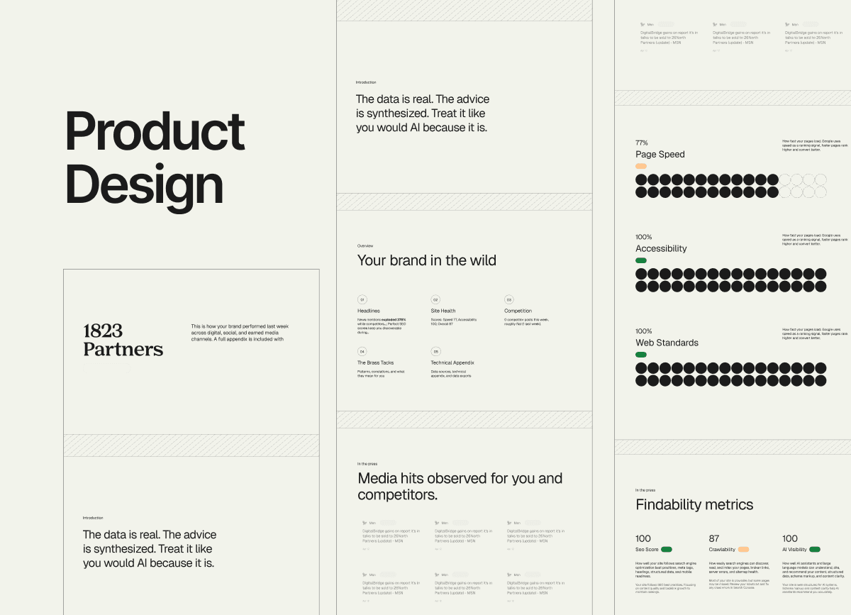
Product Design — the product itself. Designed to read like a briefing, not a dashboard. Hierarchy, contrast, and rhythm decided by us, every screen.
The most defining moment of the whole project was when we realized we weren't just designing a brand anymore. We were helping design the product.
Moonvine is a weekly website intelligence report. It pulls usage data and turns it into a piece focused on clarity and narrative.
That meant our job stopped being "make a brand work" and became "decide how this product behaves visually." Data visualization. Information hierarchy.
How to tell a story out of numbers. We had to build a design system that held a recurring report, not a brand book, not a website, but a product with weekly output.
That's the moment the project doubled in scope. And the moment it became something we hadn't done before.
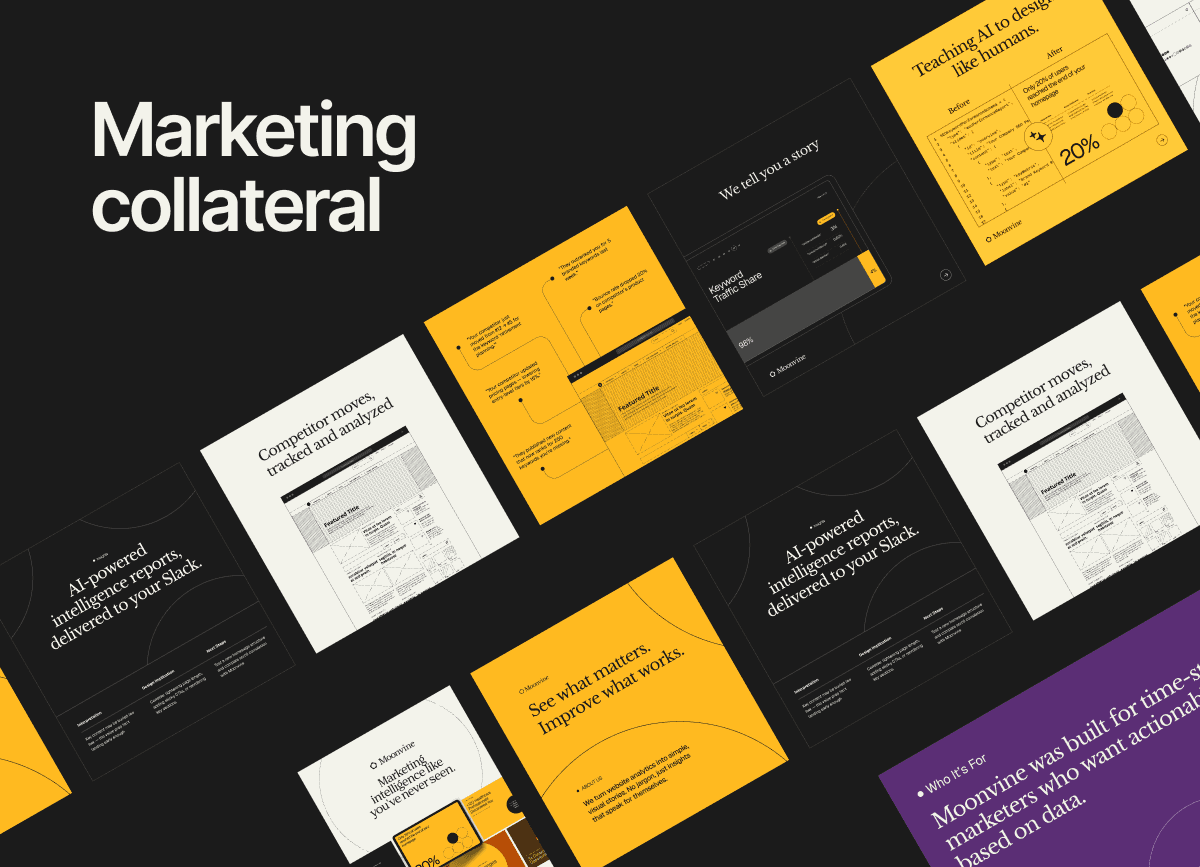
Marketing collateral — LinkedIn posts, social covers, pitch decks, slides, motion graphics, launch material. Every asset built from the same system.
Video — motion built into the brand, from product demos to the launch film.
This is one of the first times at Apta where we were giving product ideas, not just brand ones. Thinking about how the reports should behave. Building something side by side with the client, not after the brief.
It's also the first time we built a design system that wasn't for a website or a brand, it was for a product with recurring output.
Reports that come out every week. Data visualization that has to stay readable as the dataset shifts. A narrative system that holds across hundreds of future versions.
A lot of firsts, in one project. Brand, system, product, web, marketing, video — all of it, built in parallel, by the same team.
Twelve months. Every service we offer. One client. The biggest project Apta has ever shipped.
The full case lives on our site.