Visual identity gets reduced to a logo, a palette, and a couple of fonts, but we already know it's more than that.
A strong identity is a system that turns strategy into something people can see, recognize, and remember. It's how a company organizes its ideas, personality, and the space it wants to occupy, visually.
It doesn't exist to make a brand look good. It exists to make a brand look like itself.
The logo doesn't work alone
A logo is a signature. It identifies the company and helps people tie different experiences back to the same brand. But no identity holds up on the logo alone.
We recognize brands by their colors, the way they organize information, their image style, their illustrations, icons, textures, and motion.
The strength comes from the combination. When a brand can only be recognized by its logo, its visual language usually isn't developed enough yet.
WealthOps is a finance-education platform for high earners. Cover the logo on any of their pieces, a YouTube thumbnail, a course slide, a newsletter, and it's still unmistakably the same brand, because the color, the type, and the way information is arranged do the recognizing.

Consistency without repetition
A good identity doesn't force a brand into the same layout every time. It gives enough rules to protect recognition and enough flexibility to adapt across contexts.
A campaign, a loose social post, a sales deck, a product page: the pieces don't need to be identical, they need to feel like the same universe. The more consistent the experience, the less effort recognition takes.
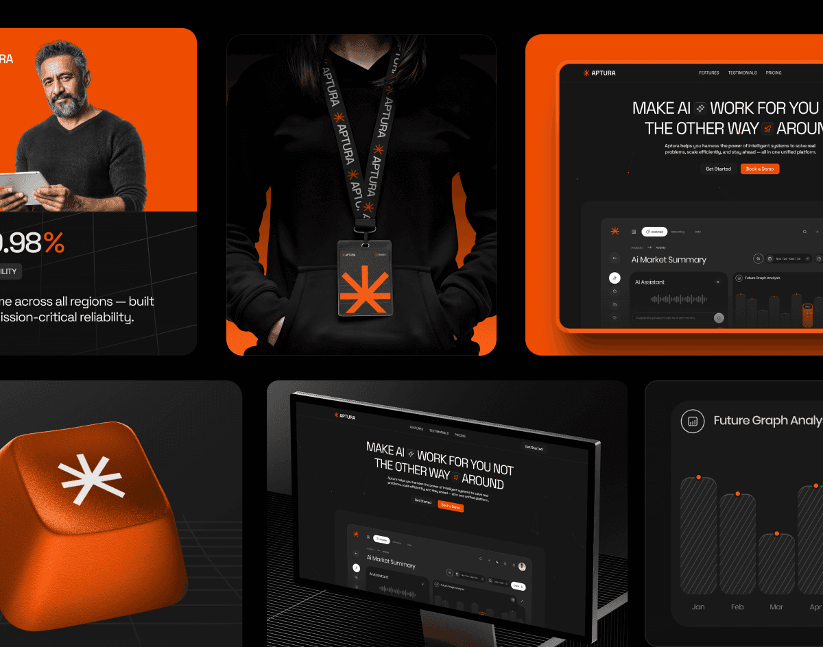
Aptura shows exactly that. It's a sleek AI SaaS spread across dozens of screens, states, and modules, where no two screens are laid out the same and every one is still, unmistakably, the same product.
Every decision carries a reason
A color isn't chosen because it's pretty. It separates a company from its competitors, carries a specific feeling, or claims visual space no one else in the category owns.
Type communicates before it's fully read. A typeface can read as technical, human, editorial, or experimental, and it shapes how a message lands.
Form does the same. Rigid lines suggest precision and structure, organic shapes suggest closeness and movement.
None of these are universally right. They have to be right for that brand. Which is why the work starts before the design, with the business, the audience, the market, and the perception the company wants to build.
A good identity doesn't answer "what looks good right now?" It answers "what does this brand need to communicate to reach its goals?"
Strategy into a system
That question is the whole job, and GoForth is a clear answer to it. The brand needed real estate investment to feel two things at once: luxurious and accessible. It's a tension most finance brands never resolve.
Every visual decision came from holding those two notes together.
The identity, the landing pages, the Meta ad creative, and a custom scheduling chatbot all speak the same language, so a first-time investor and a high-net-worth one both feel like they're in the right place.
A good identity makes communication easier
A company produces an enormous amount of material over time: decks, proposals, posts, ads, videos, pages, packaging, signage. Without a clear system, every new piece starts almost from scratch.
Decisions get remade, the result shifts depending on who's executing, and consistency erodes. A well-structured identity removes that uncertainty and lets a brand scale without losing its unity.
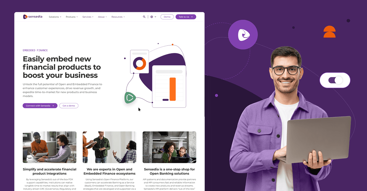
You can see the payoff in Sensedia, a digital ecosystem of more than 100 pages. At that scale, the system is the only thing that keeps a hundred pages reading as one company instead of a hundred different ones.
Identity is also hierarchy
An identity doesn't just need to be recognizable. It needs to help people understand a message. Titles, text, numbers, images, and calls to action have to sit in different positions according to their weight.
Good hierarchy directs the eye: what to see first, what supports it, what to do next. A piece can be visually interesting and still fail to communicate. If people can't understand what's in front of them, the design hasn't done its job.
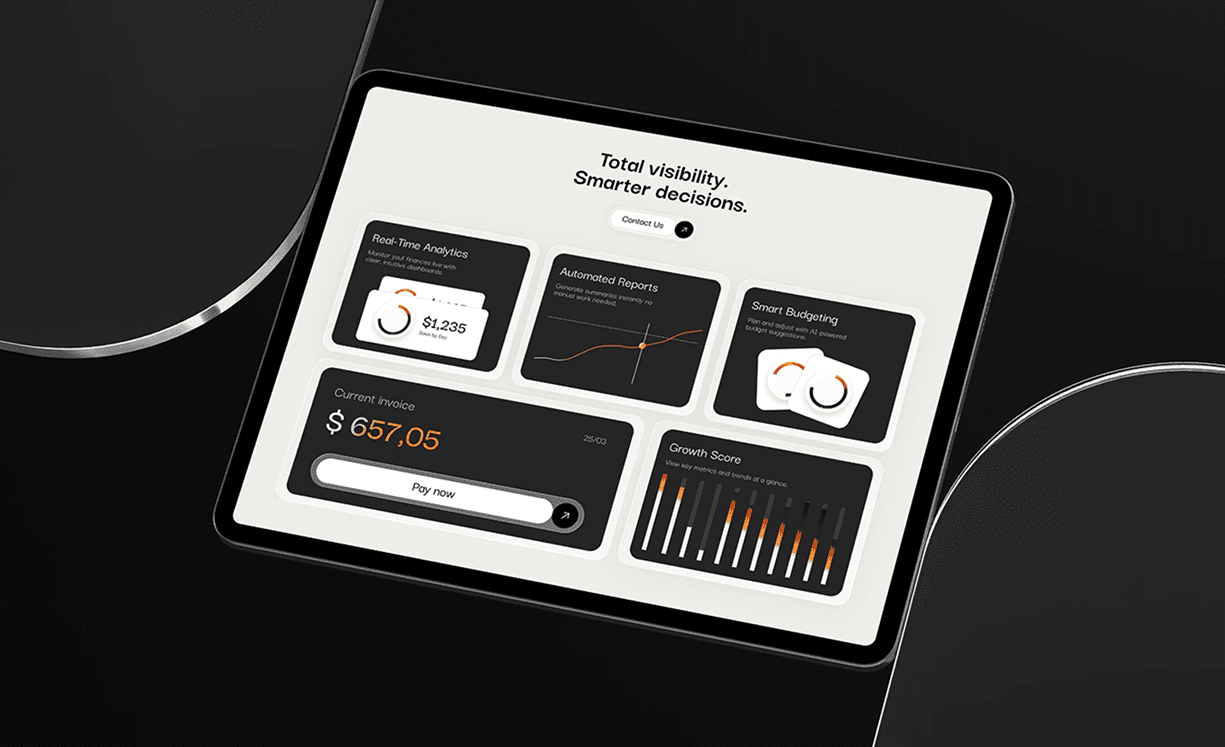
PrismPay makes that visible. It's a payment platform built on dashboards, invoices, and real-time analytics, the kind of dense data that overwhelms people when it isn't organized. Hierarchy is what turns those screens into something you can read at a glance.
It has to work outside the presentation
During a project, it's easy to build a few stunning conceptual applications. The real test is when the system gets used every day.
Does it work on a small screen? Can you build a long deck without it feeling repetitive? Does it hold up for institutional communication and fast, dynamic content? Can other people apply the brand without depending on whoever created it?
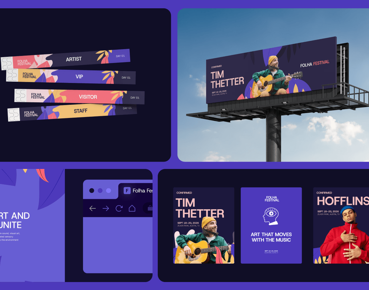
Folha Festival is a system stretched wide. One expressive identity carried across a website, posters, billboards, and campaign assets, still unmistakably the same brand in every format.
The system working in practice
Everything above comes together in Moonvine, which turns website data into simple visual stories. The challenge was translating a data product without making it feel cold, technical, or interchangeable with every other analytics platform.
The system balances digital precision with human sensibility. An organic symbol drawn from the moonvine flower. A pairing of Libre Baskerville for expressive moments and Geist for interfaces and data.
A neutral black-and-white base lifted by purple and yellow accents. Geometric elements that echo charts without literally drawing the data. In practice, one post leads with a big number, another with a single sentence, a third organizes several insights. The layouts change, the recognition stays.
Identity isn't something we put on top of a brand
It's the language we build so the brand can express itself, turning strategy into color, form, type, image, and composition. A strong identity doesn't rely on one memorable element.
It works as a set where every decision builds recognition, clarity, and personality.
Our job is to understand what makes a business unique and turn that into a system ready to grow, adapt, and stay recognizable.
Because a good identity doesn't just make a company look more professional. It makes the brand clearer, more consistent, and harder to confuse with anyone else.
Does your brand look great but mean nothing yet?